Introduction
At home I have a bunch of hard drives scattered through a bunch of machines. Most of them are monitored through SMART, with weekly short SMART self-tests and monthly long SMART self-tests. Of course, I receive an e-mail should anything go wrong during those tests, should any SMART attribute value change at any moment, or any SATA link coughing in the kernel log buffer. If you haven’t already, you should configure your systems this way too.
In mose cases this is enough, and helps detecting a failing hard-drive. This doesn’t always work, but I found out with the experience that it does work reasonably well for hard-drives, and maybe a bit less for solid-state drives (yes OCZ, I’m looking at you, or, well, at what remains of you). Still, I was curious and wanted to check if there was another more “graphical” way of assessing the healthiness of a given hard-drive.
Recording the read speed
Recent versions of ddrescue are capable of measuring the read speed as they’re rescuing the sectors of your hard-drive. This is handy because on top of that, with some perl and some gnuplot we can do some interesting things.
First, we need the list of our hard-drives, excluding the SSDs:
1
2
3
4
5
# lsblk -lno type,rota,name,model,serial | awk '{if($1=="disk"&&$2==1){print $3","$4,$5,$6}}'
sda,WDC WD30EFRX-68E WD-WCC4N2DVXXXX
sdb,WDC WD30EZRX-00M WD-WCAWZ301YYYY
sde,WDC WD30EZRX-00M WD-WCAWZ301ZZZZ
sdf,ST10000VN0004-1Z ZA21WWWW
Here, we used lsblk with an awk filter to only include “rotational” drives (i.e. HDDs).
We also have the model names and serial numbers of each drive.
Let’s now launch ddrescue and tell it to read the whole drive sequentially, only once (no retry, trim or scraping), and push it to /dev/null. We are only interested by the read speed that will be logged thanks to the --log-rates parameter.
1
2
3
4
5
6
7
8
9
# ddrescue -fnNb 4096 --log-rates=sdf.rates /dev/sdf /dev/null sdf.map
GNU ddrescue 1.22
     ipos:   10000 GB, non-trimmed:        0 B,  current rate:  30867 kB/s
     opos:   10000 GB, non-scraped:        0 B,  average rate:    191 MB/s
non-tried:        0 B,  bad-sector:        0 B,    error rate:       0 B/s
  rescued:   10000 GB,   bad areas:        0,        run time: 14h 29m 13s
pct rescued:  100.00%, read errors:        0,  remaining time:         n/a
                              time since last successful read:         n/a
Finished
You can do this while your drive has mounted partitions, as we’re only reading from it. But if you want precise measurements, it’s better to do it on an unmounted drive, as it’ll ensure ddrescue is the only program interacting with the drive.
The exampe above is a 10 TB drive, reading every byte from it took more than half a day at 191 MB/s on average.
Let’s see how the rates file looks like:
1
2
3
4
5
6
7
8
9
10
11
$ head sdf.rates
# Rates Logfile. Created by GNU ddrescue version 1.22
# Command line: ddrescue -fnNb 4096 --log-rates=sdf.rates /dev/sdf /dev/null sdf.map
# Start time:   2019-01-26 23:42:27
#Time  Ipos  Current_rate  Average_rate  Bad_areas  Bad_size
 0  0x00000000         0         0        0         0
 1  0x0A9D0000  178061312  178061312        0         0
 2  0x194F0000  246546432  212303872        0         0
 3  0x28B50000  258342912  227650218        0         0
 4  0x37370000  243400704  231587840        0         0
 5  0x458D0000  240517120  233373696        0         0
We’re interested in the ipos and the current_rate columns.
Let’s extract those to a .csv, and convert the ipos column to decimal in the process:
1
$ perl -ne 'm{^\s*\d+\s+(0x\S+)\s+(\d+)} or next; $s > hex($1) && exit; $s = hex($1); print hex($1)/1024/1024/1024 . ";" . $2/1024/1024 . "\n"' sdf.rates > sdf.csv
Now let’s use gnuplot to graph the data: we want to have the instant read speed in function of the read position of the drive:
1
$ gnuplot -e 'set term png; set nokey; set title "Seagate IronWolf 10 TB (1.5y old)"; set xlabel "disk read position (GiB)"; set ylabel "read speed (MiB/s)"; plot "sdf.csv" using 1:2 "%lf;%lf" with dots' > sdf.png
I’ve done this with most of my hard-drives in the last few days, the results follow.
The results
Seagate IronWolf 10 TB
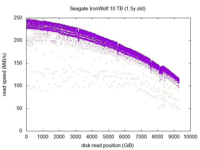
One dot on the graph represents the read speed during one second. We can see a few interesting things.
The general aspect of the main curve, ranging from 230-250 MiB/s at the beginning of the drive to 110-130 MiB/s towards the end. This is to be expected, as the physically outer part of the platters are the logical beggining on the drive, and the closer the head comes to the center of the platters, the closer we are at the logical end of the drive. As the platters rotational speed is constant (the usual 5400/7200/1000 RPMs), there is more data spinning under the read/write heads at the logical beginning of the drive (outer part of the platters) than at the end (inner part of the platters).
The 3 little snicks with lower read speeds around the 3100, 5600 and 7500 GiB marks, and the little plateau around the 8200 GiB mark. I have no explanation for them. This drive has 7 platters, so it doesn’t match the number of snicks. This might be measurement artifacts, but as the drive was unmounted, and the snicks and plateau are several “GiB” in length, this is highly unlikely. It’s more probably linked to the inner design of the drive. Nothing to worry about though.
If we look closer, we can actually see 3 curves:
-
The main and upper one, having the vast majority of scattered dots. The reads there are optimal and done at full read speed.
-
Right under the first curve, we can see another curve with way, way less dots. It’s ressembling a shadow of the first one. The reads from this second curve are probably done in a more careful way, because data was harder to read there, or maybe some retries were needed to get the data properly. Note that this is entirely done within the firmware of the drive, the OS never knows about it. The read speed is the only measurable artifact of this behaviour. It’s still very fast though, the read events present in the second curve are done at roughly 90% of the full read speed. This is unnoticeable in everyday use.
-
A third ghostly curve with very few dots, representing around 50% of the full read speed. Those are drive offsets where the heads had to take twice the usual time to fetch the data. As there are a very few number of dots, there’s really nothing to worry about, another second tests might show different offsets with slow-ish read speed. This doesn’t necessarily indicate damage on the platter, maybe it was just a little positioning error of the head, or some minor issue like this, transparently handled by the firmware by retrying the read. As always, the OS never knows about it. This is still 50% of the max read speed and in very very few occasions (~0.2%), so this is unnoticeable in everyday use either.
This drive seems to be in a pretty good shape. We’ll see in a few years if it stays that way!
Western Digital Red 3 TB
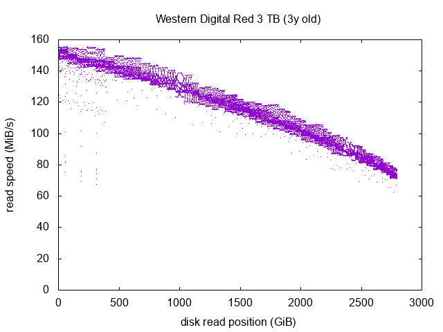
On this drive the main curve looks quite good. There is a somehow strange shape right at the 1000 GiB mark, it’d be interesting to run the test again and see if it appears a second time. In any case, almost all the dots are part of the main full-read-speed curve, so this indicate a drive in quite a good shape. We have a few repeated speed drops within the first 500 GiB mark, but nothing too worying (it never goes under 60 MiB/s), however this should definitely be something to monitor in the future.
Western Digital Caviar Green 1 TB
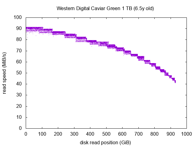
We can notice than the “Red” and the “Green” versions of the Western Digital drives are clearly behaving differently: the global shape of the curves is completely different. The curve of the Red model almost looks like a straight line, whereas the curves of the Green model has a lot of steps. As we’ll see in the next section, these steps are exactly the same between the three Green models I have, so this is not indicating faulty drives, it merely indicates how the inner functioning of the Red and Green models are different. The Red models are supposed to be more NAS-friendly, whereas the Green models are supposed to be more Desktop-friendly. I always thought this was more or less marketing gibberish, and that the Green drives were just spinning slower and had more aggressive power management tunings. However we can see here that the difference seems to go deeper.
Now on to this drive: despite its age, it seems to be in a perfect shape, we see almost no dot below the main curve. I’m not expecting this drive to fail too soon (excluding sudden internal electronics breakdown or drive head crashes, obviously). This drive is part of my backup machine, which is only powered-on a few minutes per week.
Western Digital Caviar Green 3 TB (x2)
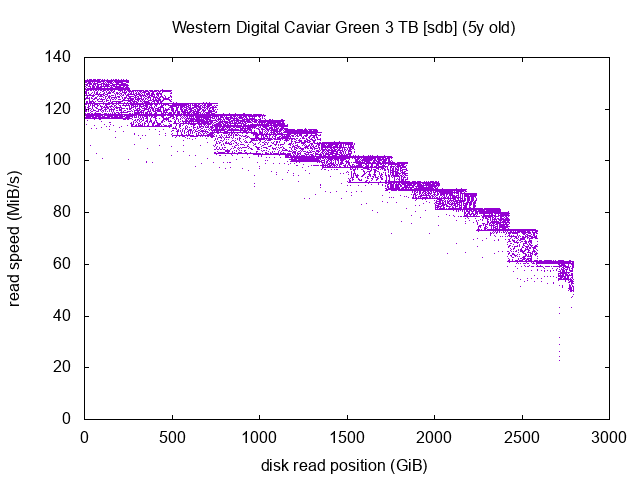
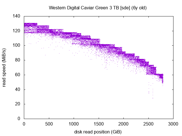
Those two measurements are very interesting. I happen to have 2 drives of the same brand and model, but one is 1 year older than the other.
The two graphs are very lookalike, this shows that the inner mechanics of both drives are the same. On the sdb graph, if we take one plateau between two steps, we can see that it looks like a square. Take the one just before the 500 GiB mark for example. The more dots we have on the upper part of the square, the better it is. Dots in the middle and the lower parts of the square indicate slighly lower read speeds. If you take the same square but on the sde graph, you’ll see that the lower part of the square seems to be decaying and dots that would constitute it are instead scattered at lower read speeds further down the graph.
Both drives are still in an “okay” shape as it seems, as all in all, most dots are on the main full-speed curve, but clearly the age difference can be seen and the older drive has more dots scattered below the curve. This drive should be monitored closely.
I’ve often heard that the expected lifetime of an HDD was around 5 years. I wasn’t expecting to have an illustration of this in a so visual way! Of course the “5 years” mark is nowhere to be a golden rule, it’s more like an rough trend, but it happens to be very visible here between two drives of the same model.
Western Digital Blue 1 TB
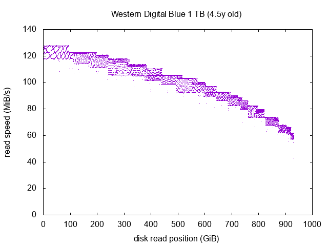
This curve looks a lot like the Green drive models. The square before the 100 GiB mark is interesting, I think we should even be able to deduce the number of platters constituting the drive by looking closely at the pattern.
Anyway, this drive seems in a perfectly good shape. This is not part of my NAS but in fact in my desktop computer, so it’s often in stand-by or hibernation (the 4.5y old indication is actually the number of power on hours of the drive, as recorded by SMART, not the actual number of years since it was manufactured).
Samsung SpinPoint F2 1 TB
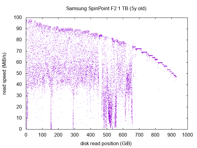
Well, this drive, on the other hand, looks like a wreck. Let’s analyse this graph if from right to left.
We can see after the 700 GiB mark that the drive seems okay: its normal read pattern is a bit like the Western Digital Green drives: with a lot of steps. But there, individual steps are not looking like squares, they’re perfect horizontal lines. This “okay” part is located on the inner part of the platters.
Between the 500 GiB and the 700 GiB mark, the drive is in a very bad shape, most reads are under 30 MiB/s, down to the normal speed of ~80 MiB/s around this section of the drive. This is especially bad around the 500 GiB mark, where we have a high density of dots around 15 MiB/s. Not good at all.
Before the 500 GiB mark, we can barely see the normal full-speed curve, and most of the dots are completely scattered between 40 MiB/s and the full-speed curve. This is bad. We can even see several reads below 10 MiB/s and even below 1 MiB/s at the 0 GiB mark, around the 150 GiB mark and right before the 300 GiB mark. This drive happens to have 11 bad sectors reported by SMART. No wonder where they’re located!
I expect this drive to either embrace a catastrophic failure in the next months, or continue degrading with more and more unreadable sectors. It’s part of a mirror ZFS on my backup machine (which is actually a backup from my NAS which is already doing backups), so loosing this drive wouldn’t mean loosing data for me. Still, it should fail quite soon.
The 11 unreadable sectors reported by SMART have been reported in the last few months, but we can be sure that the overall degradation of the read speed has been ongoing for way more time than this: I would have been able to predict these bad sectors if I had the idea to run this test sooner on this drive!
Conclusion
This method is a very interesting way to closely assess the healthiness of your home drives. It is a good complement to he usual SMART monitoring. It takes a few hours to half a day depending on the capacity and heath of your drives, so it’s probably a good idea to do it once or twice a year at most.
This would of course be impractical in a professional environment because it requires the drive to be unmounted and read sequentially, but it’s an interesting way to gauge the healthiness of your home drives.
It’s also worthy to note that the SpinPoint drive is the only one showing a bad SMART status, all the others are seen as heatlhy, but still we can see by carefuly measuring the sequential read speed that some are in better shape than others.